The job
The brief
Thatch House offer treatment at a level their materials didn't reflect. Patients paying private fees are reading every signal, and the old identity was telling them the wrong story before they'd walked in.
What we did
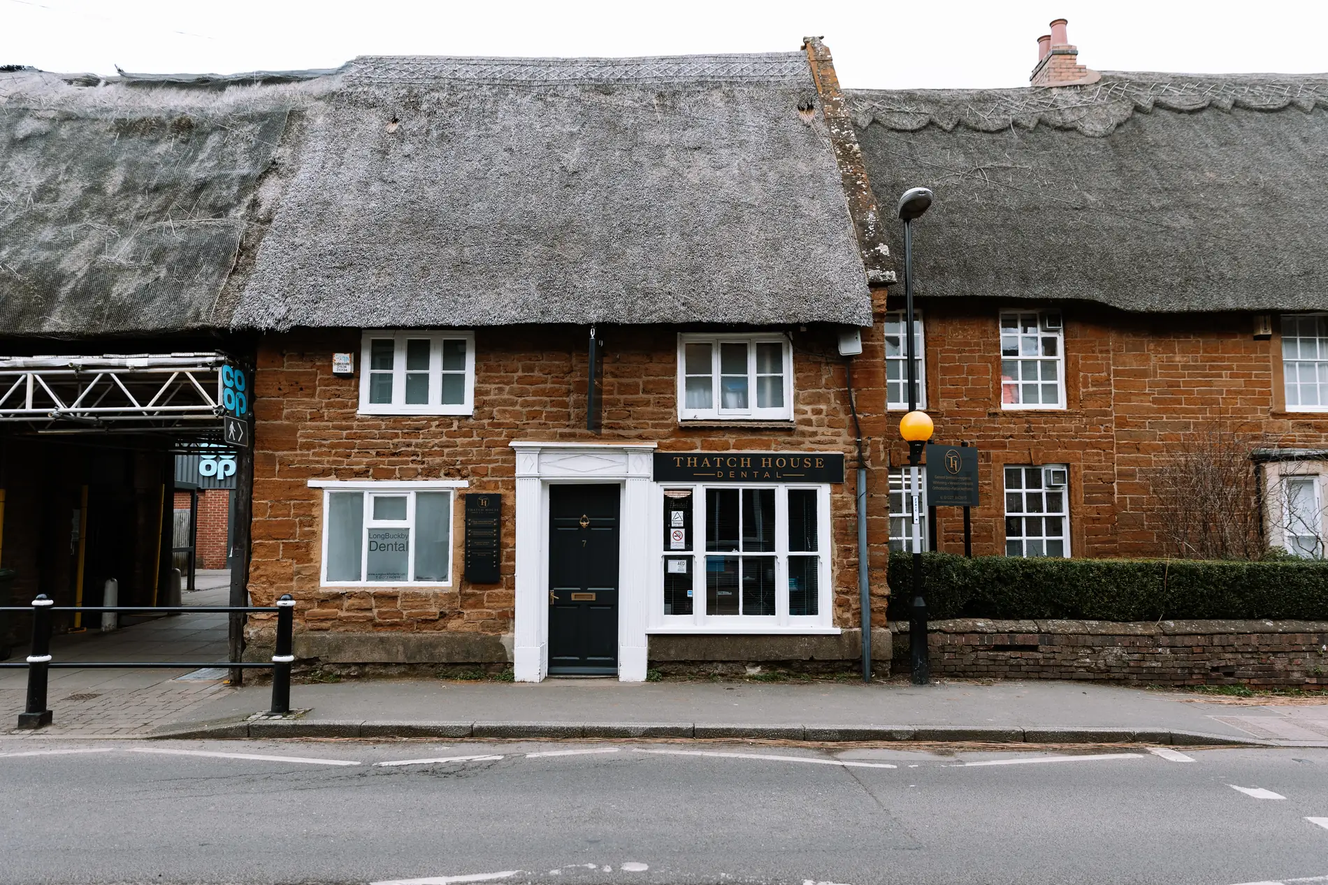
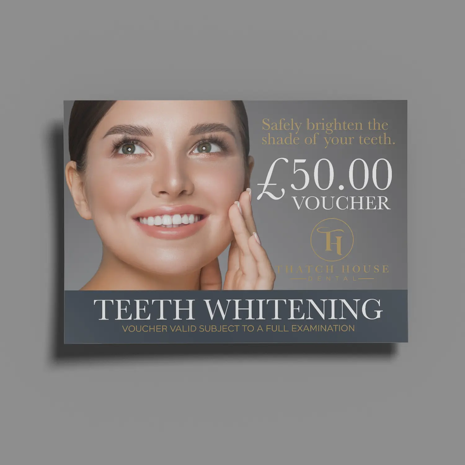
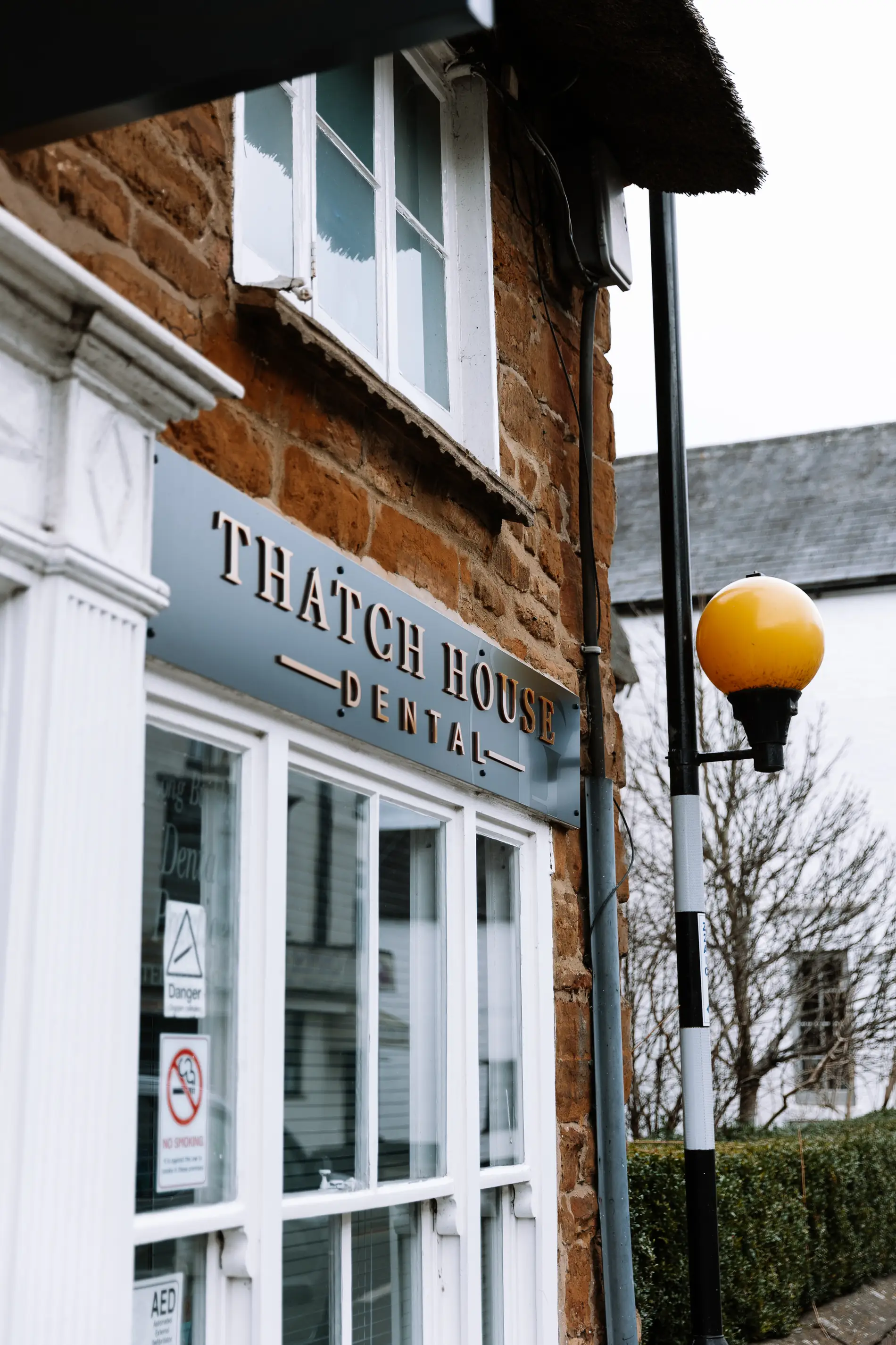
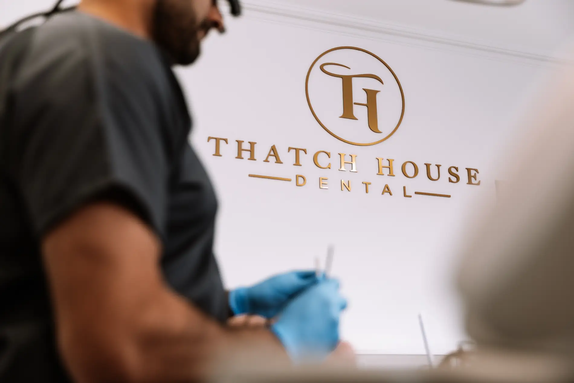
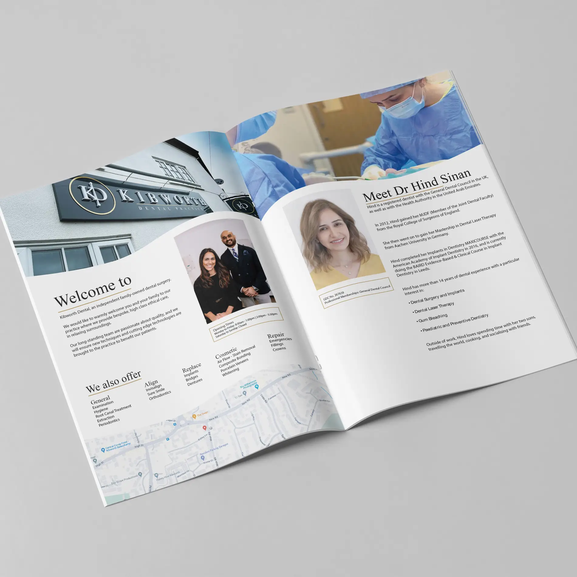
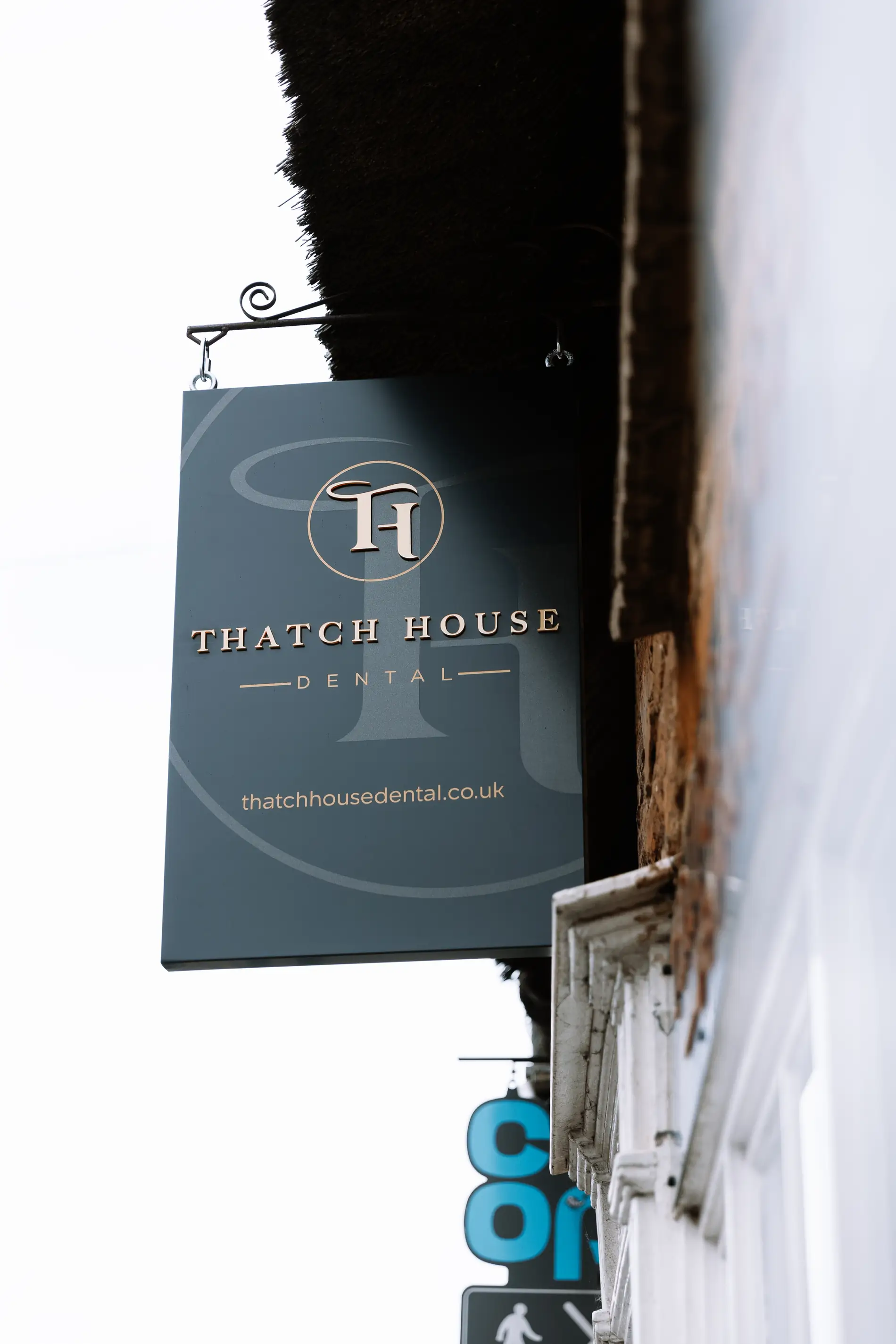
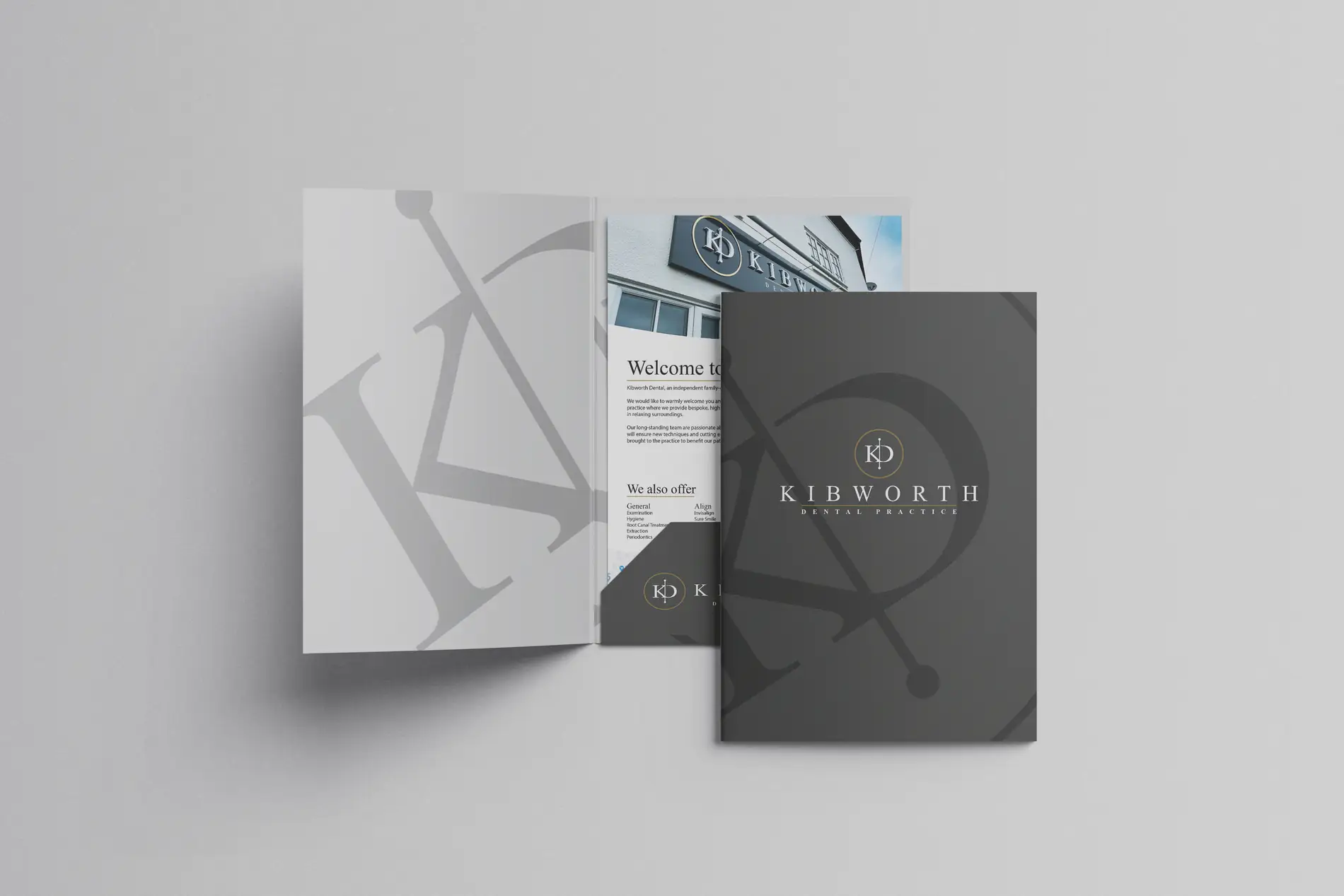
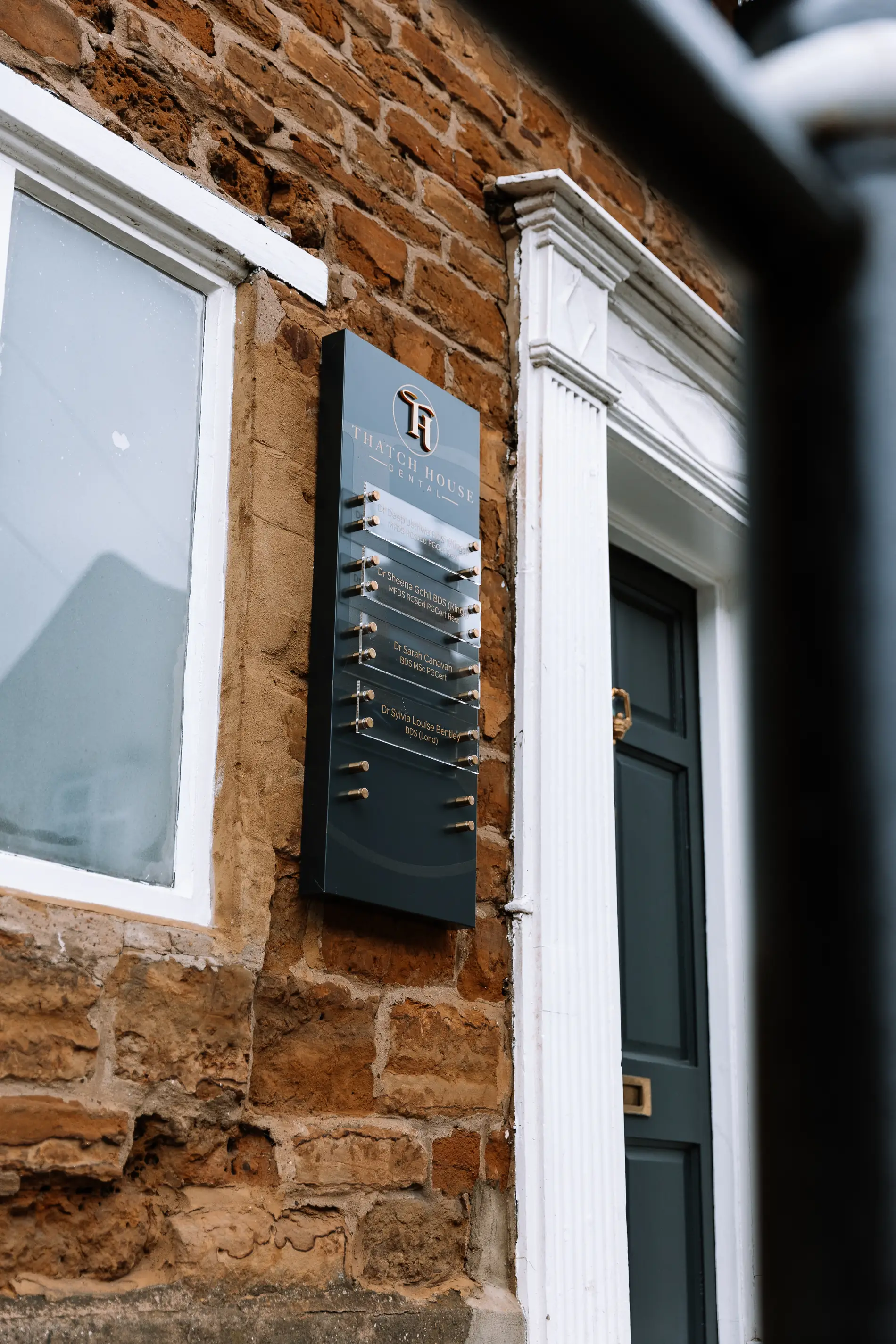
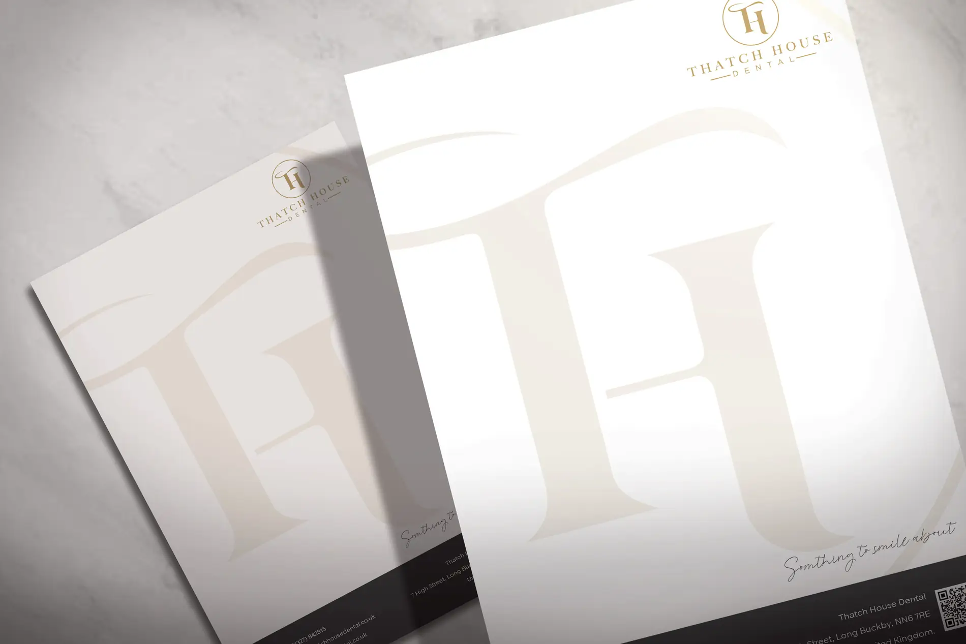
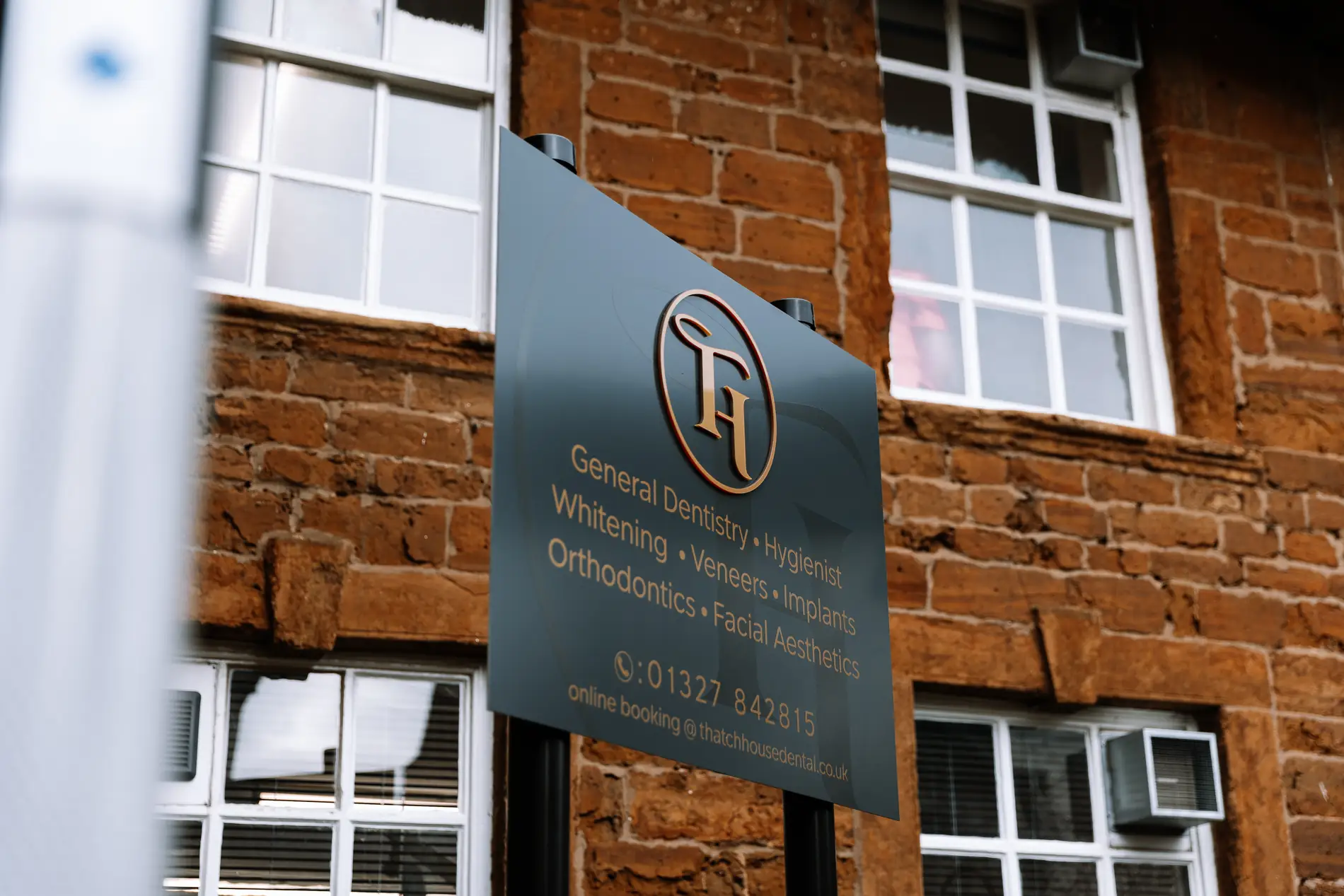
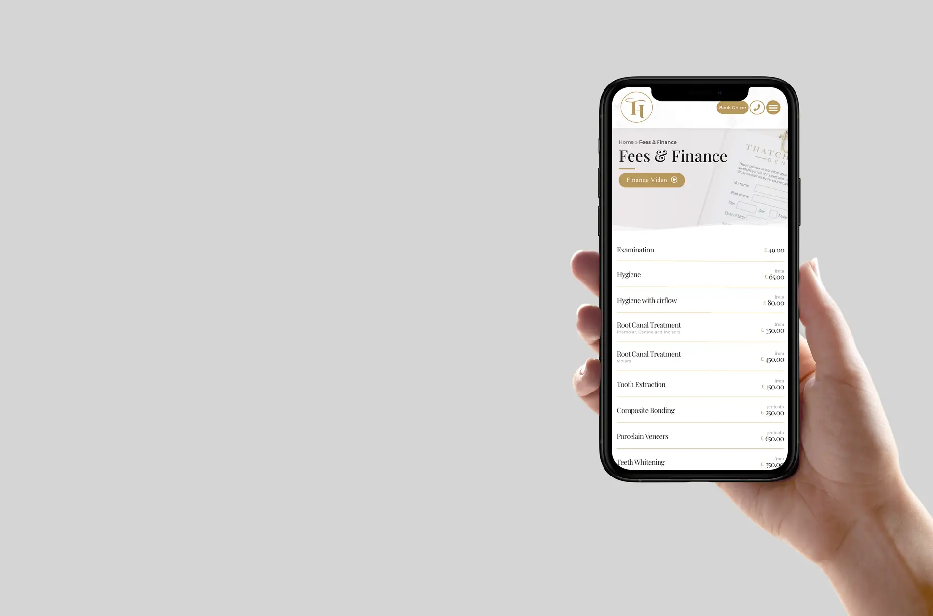
A gold-and-deep-neutral identity that feels considered rather than clinical, carried across a website built around treatments and booking, an A4 brochure, presentation folders, letterheads, and external signage with nameplates and opening-times panels sized for a period frontage.
How it landed
One coherent brand from the road sign to the appointment card — the sort of consistency that quietly justifies a private fee.
disciplines in one project
coherent brand
launched


Next step
Want something like this?
Tell us what you’re after and we’ll tell you straight whether we’re the right fit. First conversation’s free and there’s no hard sell — we’re not built that way.